Describing Single Variables
Descriptive statistics refers to a set of techniques for summarizing and displaying data. Let us assume here that the data are quantitative and consist of scores on one or more variables for each of several study participants. Although in most cases the primary research question will be about one or more statistical relationships between variables, it is also important to describe each variable individually. For this reason, we begin by looking at some of the most common techniques for describing single variables.
The Distribution of a Variable
Every variable has a distribution, which is the way the scores are distributed across the levels of that variable. For example, in a sample of 100 university students, the distribution of the variable “number of siblings” might be such that 10 of them have no siblings, 30 have one sibling, 40 have two siblings, and so on. In the same sample, the distribution of the variable “sex” might be such that 44 have a score of “male” and 56 have a score of “female.”
Frequency Tables
One way to display the distribution of a variable is in a frequency table. Table 12.1, for example, is a frequency table showing a hypothetical distribution of scores on the Rosenberg Self-Esteem Scale for a sample of 40 university students. The first column lists the values of the variable—the possible scores on the Rosenberg scale—and the second column lists the frequency of each score. This table shows that there were three students who had self-esteem scores of 24, five who had self-esteem scores of 23, and so on. From a frequency table like this, one can quickly see several important aspects of a distribution, including the range of scores (from 15 to 24), the most and least common scores (22 and 17, respectively), and any extreme scores that stand out from the rest.
|
Self-esteem |
Frequency |
|
24 |
3 |
|
23 |
5 |
|
22 |
10 |
|
21 |
8 |
|
20 |
5 |
|
19 |
3 |
|
18 |
3 |
|
17 |
0 |
|
16 |
2 |
|
15 |
1 |
There are a few other points worth noting about frequency tables. First, the levels listed in the first column usually go from the highest at the top to the lowest at the bottom, and they usually do not extend beyond the highest and lowest scores in the data. For example, although scores on the Rosenberg scale can vary from a high of 30 to a low of 0, Table 12.1 only includes levels from 24 to 15 because that range includes all the scores in this particular data set. Second, when there are many different scores across a wide range of values, it is often better to create a grouped frequency table, in which the first column lists ranges of values and the second column lists the frequency of scores in each range. Table 12.2, for example, is a grouped frequency table showing a hypothetical distribution of simple reaction times for a sample of 20 participants. In a grouped frequency table, the ranges must all be of equal width, and there are usually between five and 15 of them.
Finally, frequency tables can also be used for categorical variables, in which case the levels are category labels. The order of the category labels is somewhat arbitrary, but they are often listed from the most frequent at the top to the least frequent at the bottom.
|
Reaction time (ms) |
Frequency |
|
241–260 |
1 |
|
221–240 |
2 |
|
201–220 |
2 |
|
181–200 |
9 |
|
161–180 |
4 |
|
141–160 |
2 |
Histograms
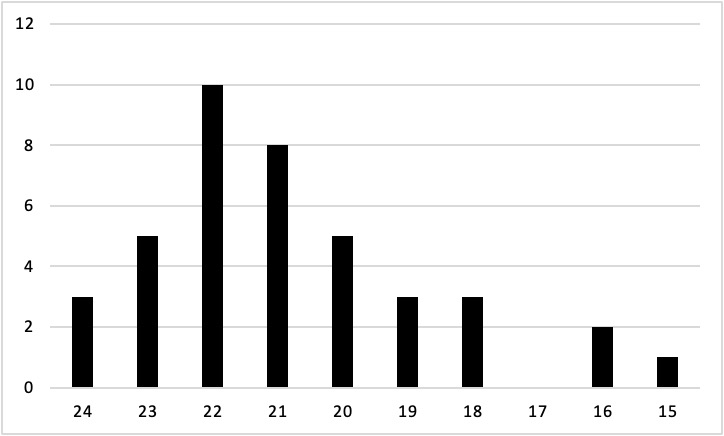
A histogram is a graphical display of a distribution. It presents the same information as a frequency table but in a way that is even quicker and easier to grasp. The histogram in Figure 12.1 presents the distribution of self- esteem scores in Table 12.1. The x‐axis of the histogram represents the variable and the y‐axis represents frequency. Above each level of the variable on the x‐axis is a vertical bar that represents the number of individuals with that score. When the variable is quantitative, as in this example, there is usually no gap between the bars. When the variable is categorical, however, there is usually a small gap between them. (The gap at 17 in this histogram reflects the fact that there were no scores of 17 in this data set.)

Distribution Shapes
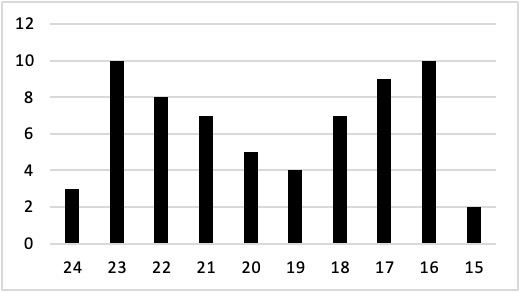
When the distribution of a quantitative variable is displayed in a histogram, it has a shape. The shape of the distribution of self-esteem scores in Figure 12.1 is typical. There is a peak somewhere near the middle of the distribution and “tails” that taper in either direction from the peak. The distribution of Figure 12.1 is unimodal, meaning it has one distinct peak, but distributions can also be bimodal, meaning they have two distinct peaks. Figure 12.2, for example, shows a hypothetical bimodal distribution of scores on the Beck Depression Inventory. Distributions can also have more than two distinct peaks, but these are relatively rare in psychological research.

Another characteristic of the shape of a distribution is whether it is symmetrical or skewed. The distribution in the center of Figure 12.3 is symmetrical. Its left and right halves are mirror images of each other. The distribution on the left is negatively skewed, with its peak shifted toward the upper end of its range and a relatively long negative tail. The distribution on the right is positively skewed, with its peak toward the lower end of its range and a relatively long positive tail.

An outlier is an extreme score that is much higher or lower than the rest of the scores in the distribution. Sometimes outliers represent truly extreme scores on the variable of interest. For example, on the Beck Depression Inventory, a single clinically depressed person might be an outlier in a sample of otherwise happy and high-functioning peers. However, outliers can also represent errors or misunderstandings on the part of the researcher or participant, equipment malfunctions, or similar problems. We will say more about how to interpret outliers and what to do about them later in this chapter.

