Chapter 4: Visuals
Using Visuals Effectively in Technical Communication
Visuals are essential in technical communication because they clarify complex ideas and make information easier to understand and remember. Diagrams, charts, and tables allow readers to grasp relationships and patterns quickly, improving efficiency by presenting large amounts of data at a glance. Well-designed visuals not only engage readers and break up dense text but also reduce the risk of misinterpretation, ensuring clearer and more accurate communication — especially in fields where precision and safety are critical.
Visuals can take many forms, depending on subject matter and audience needs. Table 4.1 shows some common types.
Table 4.1 Common Types of Visuals in Technical Documentation
| Type of Visual | Description and Common Uses |
|---|---|
| Illustrations and diagrams | Schematics, exploded views, cutaway drawings, and conceptual diagrams that explain how a mechanism or process works |
| Photographs | Real-world images of equipment, parts, or processes, often used for identification or showing real operating conditions |
| Charts and graphs | Bar charts, line graphs, scatter plots, and pie charts for showing trends, comparisons, and data relationships |
| Tables | For organizing numerical data or specifications in a concise, easy-to-scan format |
| Flowcharts and process maps | For visualizing sequences, decision points, and workflows |
| Maps | For spatial or geographic information |
| Icons and symbols | For safety warnings, user interface elements, or quick-reference markers |
| Screenshots | In software documentation, for showing menus, interfaces, or settings |
Visuals are powerful tools for the following reasons:
- Visuals summarize and organize information. For example, a table could effectively consolidate key points at the beginning or end of a report.
- Visuals enable comparisons. For instance, a bar chart is effective for comparing the incidence of heart disease across different demographic groups.
- Visuals illustrate relationships. For example, a graph could effectively display the correlation between smoking and the development of lung cancer.
- Visuals emphasize key points. For example, a flowchart might highlight the essential steps in an engineering process.
- Visuals transcend cultural and language barriers. A well-designed graph is interpretable in multiple languages, making it accessible to a global audience.
Choosing Visuals
You’ll likely use various types of visuals in your assignments and reports. The following subsections outline best practices for specific types of visuals.
Tables
Tables are a valuable tool in technical communication because they allow you to present complex or detailed information in a clear, organized, and easily scannable format. Unlike prose, which requires the reader to extract and mentally organize information, tables arrange data into rows and columns so that patterns, relationships, and exact values can be seen at a glance. They are especially useful for presenting numerical data, specifications, or comparisons where precision is essential. In engineering, for example, a table of material properties enables readers to quickly compare density, tensile strength, and thermal conductivity to select the most appropriate material for a specific application.
Table 4.2 is a good example because it uses concise headings with units and consistent numerical formatting.
Table 4.2 Material Properties of Common Structural Metals
| Material | Density (g/cm³) | Tensile Strength (MPa) | Thermal Conductivity (W/m·K) |
|---|---|---|---|
| Carbon Steel | 7.85 | 400 | 54.0 |
| Stainless Steel | 8.00 | 520 | 16.0 |
| Aluminum Alloy 6061 | 2.70 | 310 | 170.0 |
| Titanium Alloy | 4.50 | 900 | 21.9 |
| Copper | 8.96 | 210 | 385.0 |
Bar Graphs
Bar graphs are excellent for showing differences across categories or within series. Use them for general comparisons when precise measures aren’t critical. If specific values matter, label each bar with its value. Fig. 4.1 shows an example of a clustered column chart comparing tensile strength of five alloys at two different temperatures with bars labelled with the measures. Categories are displayed along the horizontal axis and values on the vertical axis. This makes it easier to compare multiple data series side by side.
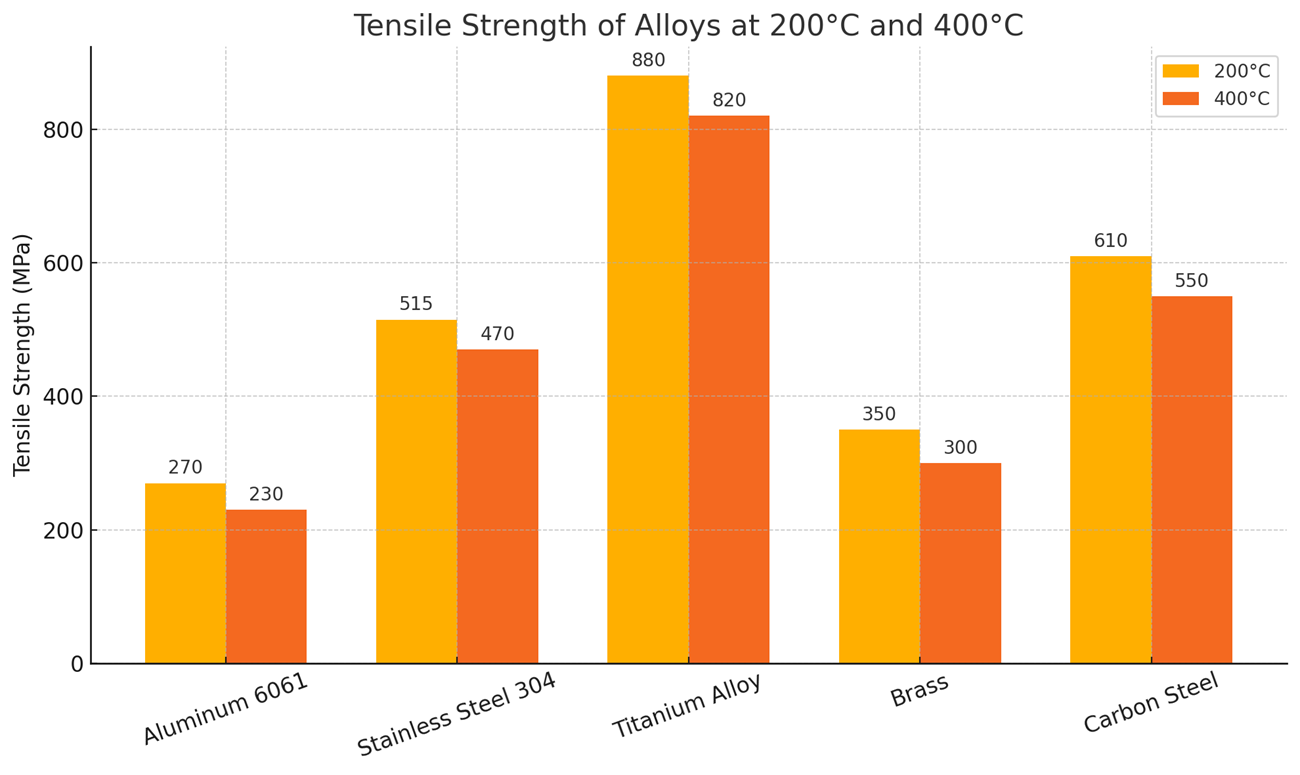
Fig. 4.1 Tensile strength decreases at higher temperatures for all alloys, with titanium alloy maintaining the highest strength retention compared to the others.
Note that the category labels in this case have been written on the diagonal because of space constraints. If category labels are long phrases, putting them on the vertical axis with measures along the horizontal axis could avoid cramping.
Stacked bar charts are useful for showing proportions within categories. Consider Fig. 4.2, showing the material composition of different battery types.
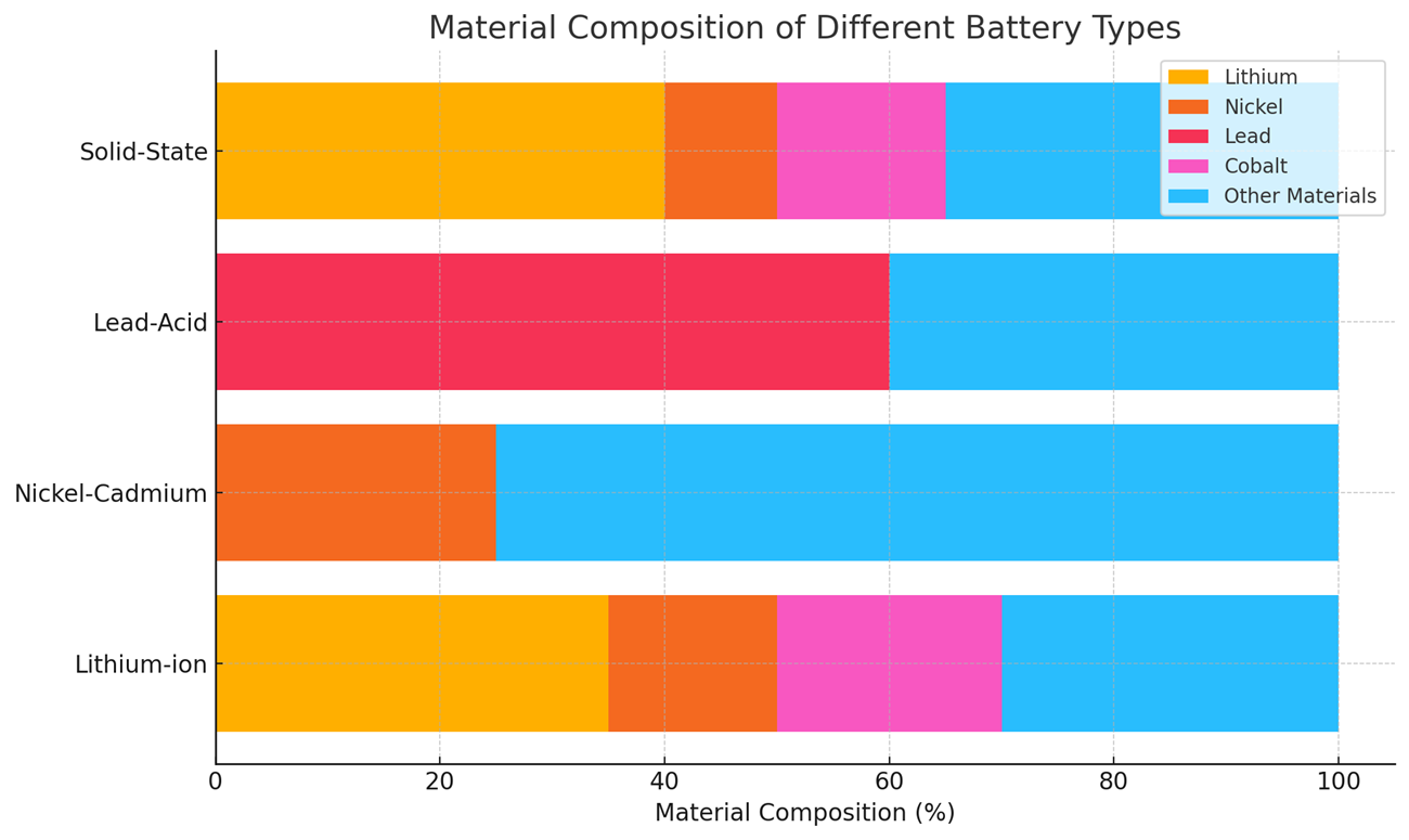
Fig. 4.2 This chart shows the percentage composition of key materials in various battery types. Lithium-ion and solid-state batteries have the highest lithium content, nickel–cadmium batteries are dominated by nickel, and lead-acid batteries contain a majority of lead, highlighting distinct material priorities for each technology.
The material composition of battery types is best shown as a stacked bar graph because it shows the whole–part relationship clearly. Each battery type is represented as a single bar that adds up to 100%, so it’s immediately clear how much each material contributes to the whole battery. It also allows direct comparison of total composition patterns. Note that the battery type labels run horizontally so that they fit comfortably on the graph.
Line Graphs
Line graphs are especially useful in engineering and technical communication when you need to show how something changes continuously or over an ordered sequence. They’re one of the most powerful tools for revealing trends, patterns, and relationships in data. For example, Fig. 4.3 could help stakeholders choose the better-performing turbine based on efficiency loss trends over time.
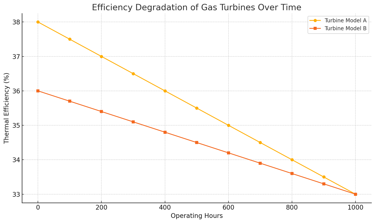
Fig. 4.3 Both turbine models lose efficiency with increasing operating hours, but Model B maintains a slower rate of degradation, suggesting better long-term performance.
Note that lines in the graph only approximate the values between data points. To ensure line graphs are used ethically, clearly state if any smoothing or transformations have been applied. Choose axis scales and intervals that accurately reflect the magnitude and pattern of change.
Area Graphs
An area graph is a variation of a line graph where the space under the line is filled with color or shading to emphasize the magnitude of the variable. In engineering contexts, area graphs are often used to
- show how a quantity changes over time while also highlighting the cumulative size or proportion of the values; or
- compare multiple related datasets by stacking them, which reveals both their individual contributions and their combined total.
For example, in renewable energy engineering, an area graph might display the daily power output of solar, wind, and hydro sources stacked together, making it easy to see not only how each source fluctuates but also the total available power at any point. This function is illustrated in Fig. 4.4.
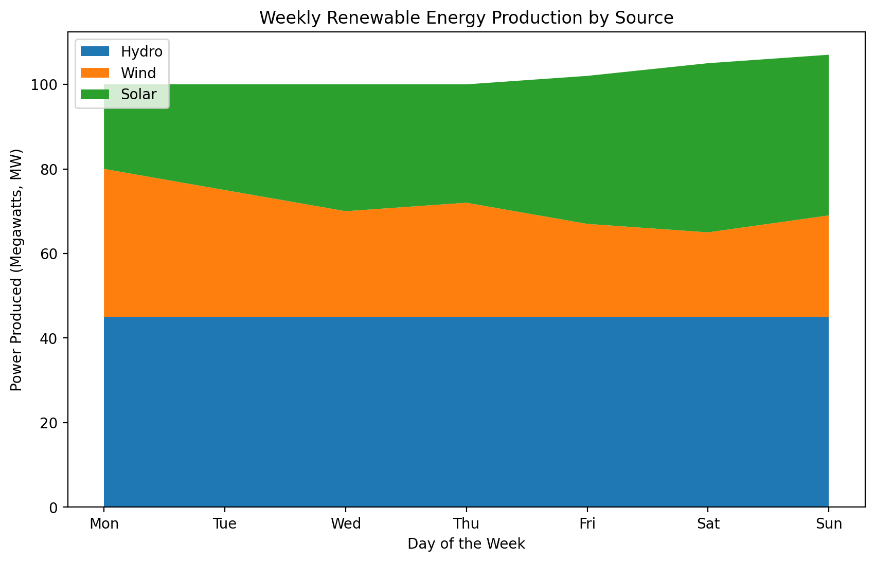
Fig. 4.4 The graph highlights both individual fluctuations in each energy source and the total combined output, showing how renewable sources complement each other across the week.
Area graphs, similar to line graphs, can show trends and totals across categories. They are effective for showing cumulative data but less so for displaying specific series values within totals.
Pie Charts
A pie chart is a circular chart divided into slices, where each slice represents a proportion or percentage of a whole. The size of each slice corresponds to its share of the total, making pie charts an intuitive way to visualize parts-to-whole relationships. In engineering, pie charts are especially effective for illustrating proportional data such as material composition (e.g., the percentage of steel, aluminum, and composites in a vehicle’s body), energy source mix (e.g., the proportion of electricity generated from renewable versus non-renewable sources), maintenance cost distribution (e.g., labor, parts, downtime, and overhead), and project budget allocation (e.g., design, testing, manufacturing, and quality control). They provide a clear visual impression of how parts contribute to a whole, making them useful for highlighting dominant categories or overall balance. However, pie charts are less effective when precise value comparisons are needed, especially if the differences between categories are small. In such cases, a bar chart or stacked bar chart offers greater clarity. They can also become difficult to interpret if there are too many small slices or if category percentages are similar, which can visually blur distinctions between them.
Fig. 4.5 is a good use of a pie chart because the data represents a composition that adds up to 100%, with a small number of clearly distinct categories. Each slice visually conveys the proportion of a specific material in the battery, making it easy to see which materials dominate (e.g., nickel) and which play smaller roles (e.g., manganese).
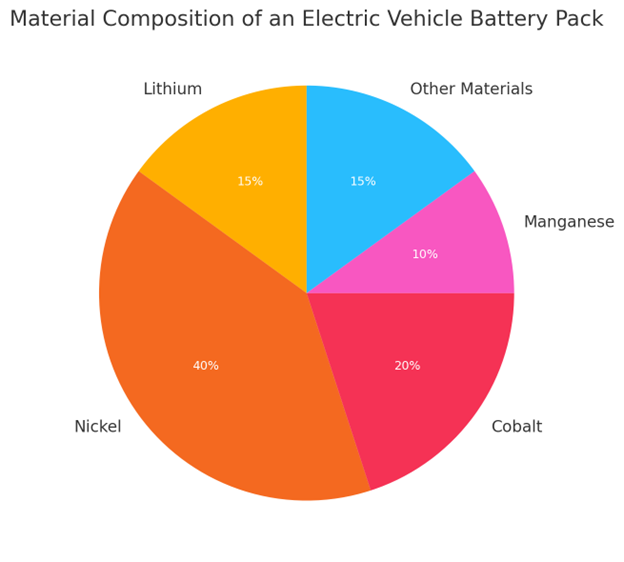
Fig. 4.5 Nickel makes up the largest portion of the battery composition, followed by cobalt and lithium, highlighting the importance of sourcing and managing these critical materials in electric vehicle manufacturing.
Pie charts are most effective for providing a quick, big-picture view of proportions rather than fine-grained comparisons, as the human eye is not good at judging small differences in angles. To maximize clarity, slices can be ordered from largest to smallest, with distinct, meaningful colors used to reinforce the message. Labels can be placed on or beside the slices as long as this doesn’t clutter the graph.
Diagrams and Photographic Images
Diagrams are invaluable in technical reports, especially for explaining complex mechanisms. For example, a diagram of a vehicle’s safety belt locking mechanism can convey information about form and functionality far more effectively than a written text. A well-designed diagram with clear labelling or a legend can simplify complex designs because it strips away unnecessary detail so the reader can focus on the most relevant features. Remember, however, to tailor diagrams to your audience’s expertise. Technical readers, such as engineers, can interpret detailed diagrams (e.g., complex circuitry), whereas non-technical readers may require simplified visuals.
Photographic images are the better choice when realism, authenticity, and an accurate depiction of an actual object or condition are essential (i.e., when readers need to recognize something exactly as it appears in the real world). They convey far more visual detail than diagrams, which can be either an advantage or a drawback depending on the context. For example, in a bicycle repair manual, a photograph of the gear assembly would reveal metal textures, grease, reflections, and parts of the surrounding bike frame — details that might distract from the form and arrangement of the components. In such a case, a simpler black-and-white diagram could focus attention more effectively on the parts themselves.
When integrating images, remember the following points:
- Simulate the typical angle of vision.
- Crop unnecessary details to focus on relevant elements.
- Label specific features.
- Include a size reference, such as a coin or a pencil, to provide context (if appropriate).
- Refer to images by figure number in your text.
- Obtain permission for images owned by others.
By using diagrams and photographic images judiciously and adhering to these best practices, you can make your technical documentation clear, precise, and engaging for your audience.
Making Visuals Accessible
Accessible technical documents present visual information in a way that is clear, consistent, and easy to understand. For example, in a manual for a complex machine, high-contrast diagrams, simple and legible labels, and concise captions can significantly improve comprehension. These elements work together to help readers quickly understand how the machine operates.
Clean, well-organized visuals enhance usability, allowing readers to find and interpret information with ease. To achieve this, prioritize clarity and consistency in your visuals, use the same terms and labels throughout the document, place visuals next to relevant text where possible, and avoid unnecessary clutter. In the following section, we’ll explore how to combine visuals and text effectively, with a focus on accessibility.
Integrating Visuals and Text
In technical communication, combining visuals with text is essential for conveying complex information more clearly than text alone. When used well, visuals can clarify concepts and improve understanding. When used poorly, they can cause confusion. The following guidelines will help you integrate visuals effectively:
- Place visuals next to the related text so that readers can easily connect what they see with what they read. When a figure, diagram, or table appears far from the section that explains it, readers must flip pages or scroll back and forth, which disrupts their focus and increases cognitive load.
- Avoid placing figures immediately after headings. Instead, introduce each figure with at least one sentence that explains its purpose. Dropping a visual directly under a heading without any lead-in text can leave readers uncertain about why it is there or how to interpret it. A brief introductory sentence sets the stage, clarifying the figure’s relevance before the reader examines it.
- Follow visuals with explanatory text that expands on what the reader sees. Use visuals to show structure or relationships and use text to explain the underlying details or implications.
Visuals provide readers with the “big picture” at a glance, while text fills in the essential details. Consider the following example in which a visual supports the explanation of a mechanical system, making its operation easier to understand.
The VertexSphere window washing system is an automated solution designed to clean exterior glass on commercial and residential buildings. It employs a dual-axis mechanism for efficient glass maintenance. Its motorized central unit travels along horizontal guide rails while deploying four microfiber cleaning pads on adjustable arms. Fig. 4.6 shows the mechanical components of the system and their arrangement on a standard window frame.
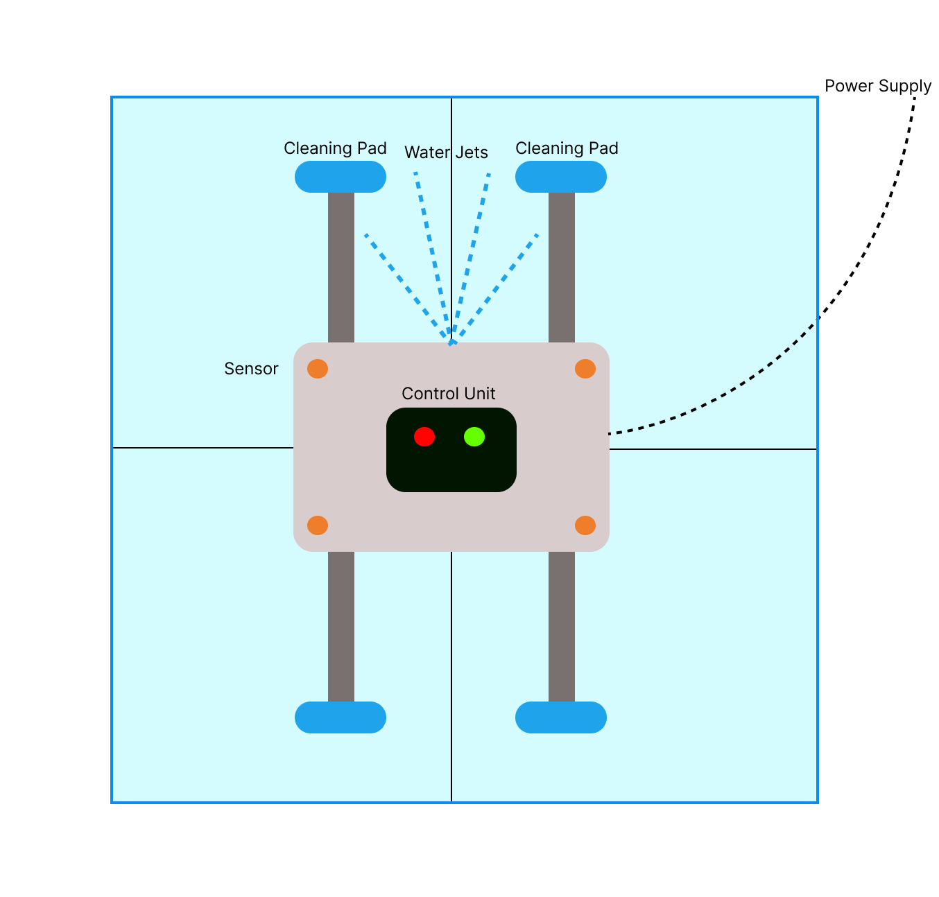
Fig. 4.6 Mechanical components of the VertexSphere window washing system, including sensors, cleaning pads, water jets, and power supply.
The system’s integrated sensors constantly monitor surface contact pressure, ensuring thorough cleaning without damage. Four precision water jets spray biodegradable solution ahead of the cleaning pads, dissolving stubborn residue. The microprocessor control unit adjusts cleaning parameters based on environmental conditions and glass type. This synchronized mechanical-electronic approach allows the VertexSphere window washing system to achieve streak-free results on buildings of varying heights.
In the example, the first paragraph introduces the system’s dual-axis mechanism and basic functionality before presenting the figure. It also mentions key components, such as microfiber cleaning pads and guide rails, to prepare readers for what they will see in the diagram. The figure, then, displays the spatial arrangement of the components, while the subsequent paragraph explains the operational details, such as how the sensors monitor the contact pressure and how the microprocessor adjusts the cleaning parameters based on the environmental conditions. This integration allows readers to easily understand the system’s physical structure from the visual while gaining a deeper understanding of its functionality through the accompanying text.
Labelling and Captions
Labelling visuals means clearly naming important parts, features, or data right on a diagram or illustration. Good labels help readers understand complex visuals by pointing out key elements and showing how they connect. When you create labels,
- use consistent formatting;
- keep text concise;
- position labels close to their referenced elements; and
- maintain a clear visual hierarchy that distinguishes labels from other text elements.
Captions work alongside labels to provide context and highlight what is most important. A caption typically includes a figure number and a brief description. Use a consistent numbering system — such as Fig. 1, Fig. 2 — in the order visuals appear in your document. Keep captions short but informative, focusing on the visual’s main point without adding unnecessary detail.
For example, the VertexSphere window washing system diagram uses clear labels to identify its key components — power supply, cleaning pad, water jets, sensor, and control unit — placed next to their corresponding parts. The caption, Fig. 4.6 Mechanical components of the VertexSphere window washing system, including cleaning pads, sensors, water jets, and power supply, provides both a sequential figure number and a concise description of the content of the figure.
Ensuring Clarity in Figures and Labels
Visual clarity is essential for effective technical communication because poorly designed visuals can confuse readers and obscure key information. To support visual clarity, use high-resolution images (at least 300 dpi for print) so details remain sharp when viewed closely. When resizing, maintain the original proportions to avoid distortion, which can misrepresent measurements or spatial relationships. This is especially critical in engineering, where accuracy is key to correct interpretation. Consistent shapes, line weights, and styling across diagrams also make visuals more polished and easier to interpret.
Labels within figures are just as important as the graphics themselves. Choose fonts that are easy to read for labels and annotations, and use a consistent style throughout all visuals. Sans-serif fonts, such as Arial or Helvetica, work well for clean, professional-looking labels. A minimum of 10 pt is generally considered safe for accessibility, without overpowering the diagram. Ensure adequate white space around labels to maintain clarity and allow for easy tracing to their corresponding elements.
Clear visuals combined with consistent typography are not just matters of design. They directly affect how well your audience can interpret and apply complex information.
Key Takeaways

Visuals are essential in technical communication because they summarize information, enable comparisons, illustrate relationships, emphasize key points, and transcend language barriers. Creating effective visuals requires attention to the following six key practices:
- Choose an appropriate visual format for the information you need to present.
- Integrate visuals and text effectively by
- placing visuals near the related text,
- introducing each visual with a brief lead-in sentence or paragraph, and
- following each visual with explanatory text.
- Label visuals clearly and use consistent terminology to prevent confusion.
- Write informative captions that include a figure number and a concise description so readers can understand the “story” of the visual.
- Ensure visual clarity through consistent formatting.
- Maintain accessibility by designing visuals that are easy for all readers to interpret.
By applying these principles, you can create visuals that are accessible, accurate, and effective in helping readers understand complex engineering information.
Practice Task
 Find a technical document in your field that contains at least three different visuals, such as graphs, charts, diagrams, photographs, illustrations, or flowcharts.
- Identify the types of visuals used and explain why each one is appropriate for its purpose.
- Choose one visual to analyze in detail by answering the following questions:
- How is it integrated into the text?
- Do the labels use consistent technical terms?
- Does the caption effectively explain the purpose?
- How could visual clarity be improved?
- Create an improved version of the visual that better applies the key elements discussed in this chapter.
